Posts tagged Traces Series
A question of genre
sherdley-road-leah-higgins.jpg

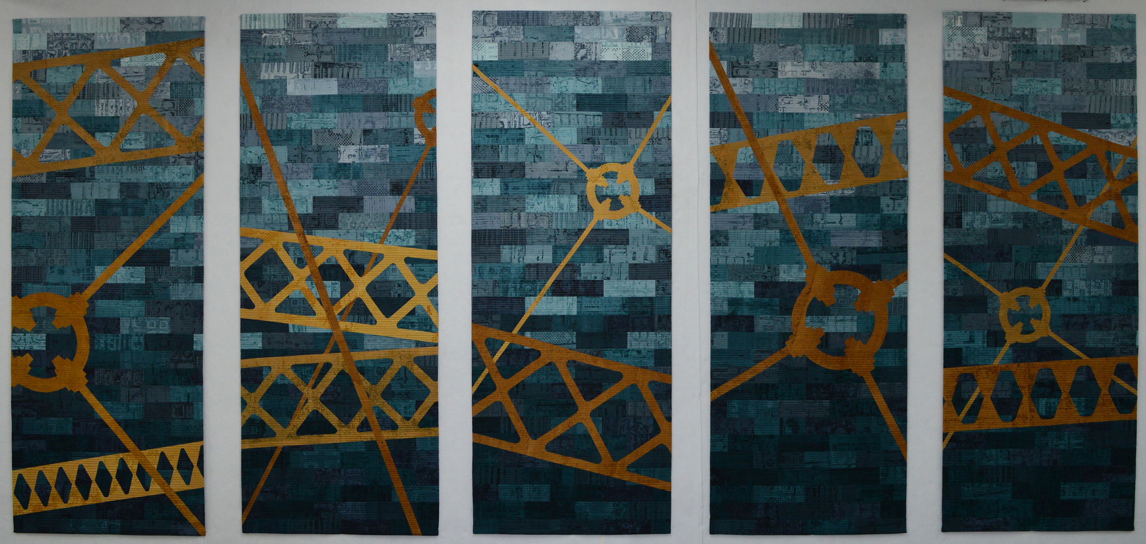
Every artist has a bridge piece in them don't they? This is mine. It is not an unusual bridge in terms of design but it is quite striking when seen from the link road in St Helens. And I've tried to capture that in this quilt. The colours look solid from a distance but closer inspection reveals lots of lovely texture created by using breakdown printing in a limited colour palette. It has been made for my upcoming exhibition with Helen Conway at The World of Glass, St Helens.

sherdley-road-detail-leah-higgins-low-res.jpg

I am really happy with this piece and may make more 'bridge' pieces but it did make me wonder about genre. I have intentionally tried to work in a more abstract way in recent years but, despite the colours used, this piece doesn't feel abstract. So what is it?

The Tate defines abstract art as 'art that does not attempt to represent an accurate depiction of a visual reality but instead uses shapes, colours, forms and gestural marks to achieve its effect'. Wikipedia defines it as art 'that uses a visual language of shape, form, colour and line to create a composition which may exist with a degree of independence from visual references in the world'. Hmm … well the colours may be abstract but, as I wanted it to look like a bridge, the finished piece cannot be called abstract.

The Tate defines figurative art as 'any form of modern art that retains strong references to the real world and particularly to the human figure'. Wiki says that figurative art 'describes artwork - particularly paintings and sculptures - that is clearly derived from real object sources, and is therefore by definition representational'. And the Tate defines representational as a 'blanket term for art that represents some aspect of reality, in a more or less straightforward way'. The quilt is not a painting, or a sculpture nor does it refer to the human figure but figurative seems like a good fit.

So what about the quilt world? If I wanted to enter it into Festival of Quilts which category would I choose? They don't have an 'abstract' category but their definition of an Art Quilt is 'quilts with both a strong visual impact and a high quality of execution designed to be displayed as artwork and communicating an idea, emotion or concept through the medium of textile and stitch'. Sherdley Road has strong visual impact and you will need to make my word for the fact that it is incredibly well made but it doesn't represent an idea, emotion or concept. It represents a bridge. Which means that it fits with their description of a Pictorial Quilt which are 'quilts depicting a scene or subject eg: people, animal, flowers etc as the main body of the quilt. A figurative or representational piece'. Hmm ….. A lot of the pieces entered into this category are very literal - often photo like representations of their subject. Wonder how my piece would be judged? I guess there is only one way to find out!

Titles

When I visit a gallery I don't tend to read the artist's statement until after I have looked at their work. I like to savour my own responses to a piece first. But I do read the title because it provides a starting place for my response. So naming my own work is important to me and the subject of many hours contemplation. And the subject of regular discussion amongst fellow artists and on social media.

Naming a series is an even bigger decision because you have to live with it longer. I am not a sketchbook person. All my ideas have a long gestation period in my head before I let them loose on dye and cloth. The titles of my first two series, Hidden Messages and Ruins, became fixed right at the beginning of that process. In Hidden Messages I wanted to develop a series of works around censorship in modern day China. In Ruins I wanted to develop a series of works around abandoned and ruined buildings. The titles were obvious to me and still feel just right. And in both cases I was happy to number the works rather than give each piece it's own subtitle.

I gave my third series a working title of Storm / Still as that seemed appropriate to the emotional rollercoaster I was on at the time. Although I numbered the early works they were either 'Storm' or they were 'Still' and each piece required it's own subtitle. The series name became fixed when I added a page to my website. Strangely I named the colour family that I developed for this series 'Dunure' (after my favourite place in the whole world after my studio). And even named a few small pieces Dunure. But I never thought to call the whole series Dunure and with hindsight I wish I had. Storm / Still feels clumsy to me now and may be one of the reasons that I don't think I will produce more in this series.

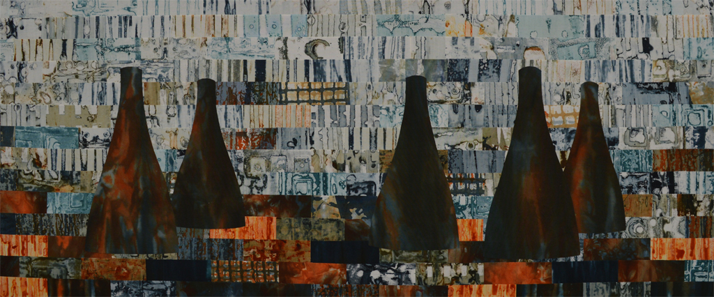
So to today. For my exhibitions next year I am working on three series each focussed on industrial and urban landscapes. One part will be more pieces in my Ruins series. Another part will be on buildings and structures still in use today that shape our landscape but are invisible to most. This series has had the working title View. The inidividual pieces will all need their own subtitles as there are site specific. So far I have made one large piece (above) and am in the process of making a series of small works called Canal Street 1, 2, 3 etc. The working title of View is no longer working for me. Instead I am officially naming the series Structures. Yes it has been used by many, many artists but it is the perfect title for what has inspired my work.

The other series is inspired by industries and iconic structures that no longer exist. I already know the subtitle of the large scale piece that is gestating in my head but I'm stuck on titles for the series of small works I am currently making based in the Bold Colliery near St Helens. And I am definitely stuck on a title for the series. I have had a working series title of Gone but that doesn't even work as a working title. I have been puzzling over this all week. I almost settled on Relics. But then I had a 'duh' moment.

The title of the exhibition in St Helens is TRACES. My inspiration is those structures that have left TRACES in our memory. No brainer! This new series is now officially called Traces.

The title of the exhibition in Stockport is FRAGMENTS. The small works are just that - they are small FRAGMENTS of a much bigger series. The series of small works is now officially called Fragments.

And now I need a long lie down in a dark room ....

20 days later

So what have I achieved after 20 days of my 100 (week) day challenge? The answer - an awful lot more than I was expecting. Albeit they still need stretching over canvas I have completed three 12x30 inch Kilns pieces with another one ready to stitch. I've also completed twelve 8x8inch pieces in a mini-series called Canal Street with another eight pieces ready to stitch. Wow!
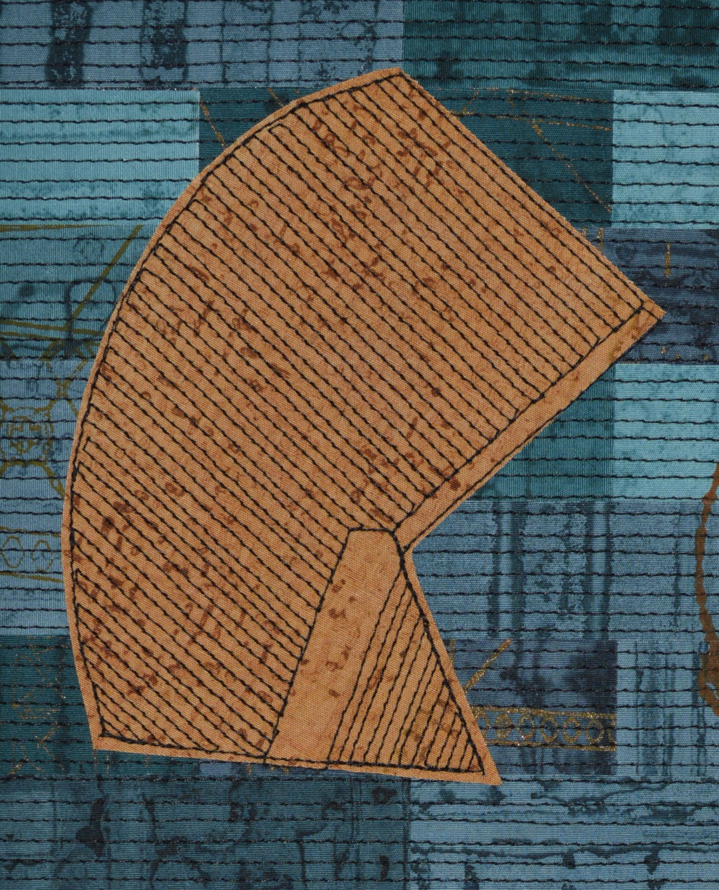
I have felt such a strong compulsion over recent years to make BIG that making small has felt like hard work. It's OK when I'm just sampling something but I can feel myself shy away from making small pieces that are intended to be exhibited. With two big exhibitions scheduled for 2018 I knew that I had to get past this. Hence my 100 (week) day challenge. I'm pretty good at self-motivating but there is nothing like putting something in the public domain to focus the mind. And I am really, really happy that my good friend Linda Bilsborrow has joined me in the challenge.

This last weeks summary ...

  • Day 16 - 2 1/4 hours
  • Day 17 - 2 1/2 hours
  • Day 18 - 1 hour (and that is being generous, I was distracted by a tub of Ben & Jerry's Sofa So Good and Netflicks)
  • Day 19 - 2 hours
  • Day 20 - 2 1/2 hours

I was planning on spending this coming week finishing the Canal Street pieces but I've nearly run out of the Madeira Cotona thread I use and my local stockists are out. Darn. Big order placed but in the meantime I'm going to use the week to develop the third series of work needed for the exhibitions. And this time I am going to work small from day 1.

Inspiration

Inspiration is a very personal thing. My inspirations are nearly all urban. I love industrial landscapes although it is getting harder to distinguish between pale grey corrugated metal retail parks and pale grey corrugated metal factories. Some would say that both are factories.
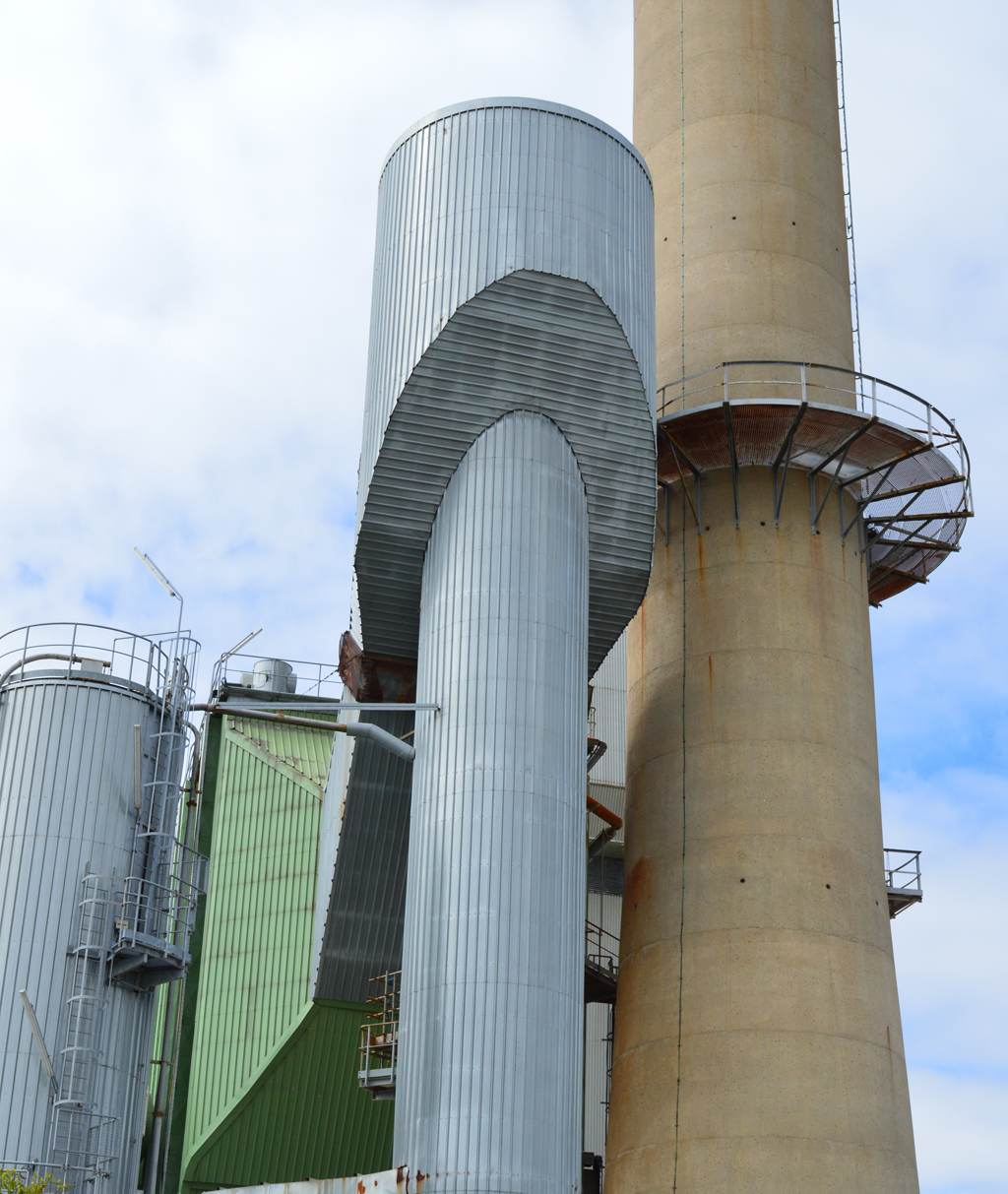
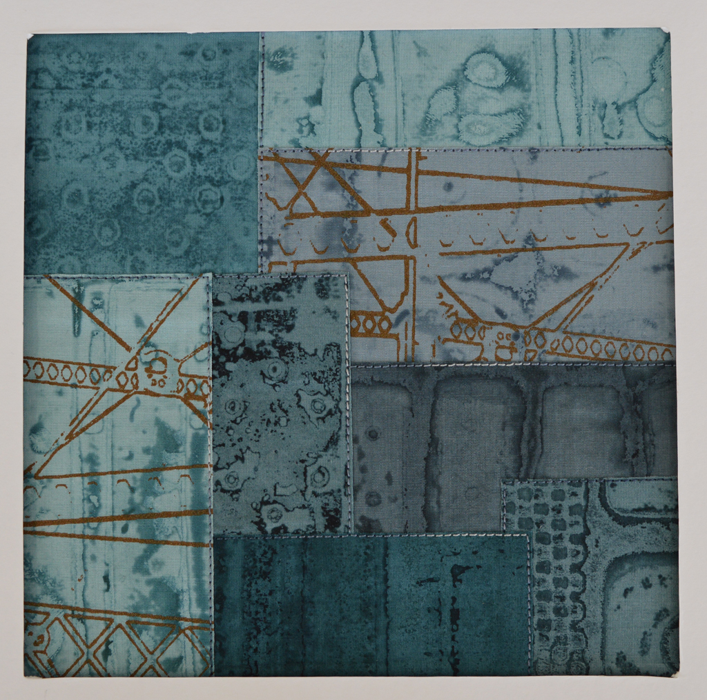
But occasionally there is a flash of colour, a wonderful shape or an interesting interplay of lines breaking up the sky. The Pilkington Glass site on Canal Street, St Helens is fabulous. It has the usual grey boxes, pipes and conveyors running between buildings. It also has towers and shapes that are quite unique and, hopefully, still recognisable as I try to use them in an abstract form in the work I'm creating for my joint exhibition with Helen Conway in St Helens next year.


In the cold light of day

Knowing that I have two major exhibitions with Helen Conway in 2018 is amazing. Although I've worked in series for the last few years this will be the first time that I get to create a cohesive body of work knowing the pieces will be hung together. And knowing the spaces where they will hang. Yes Helen and I need to make sure that our work will work together in each space but otherwise the sky is the limit!
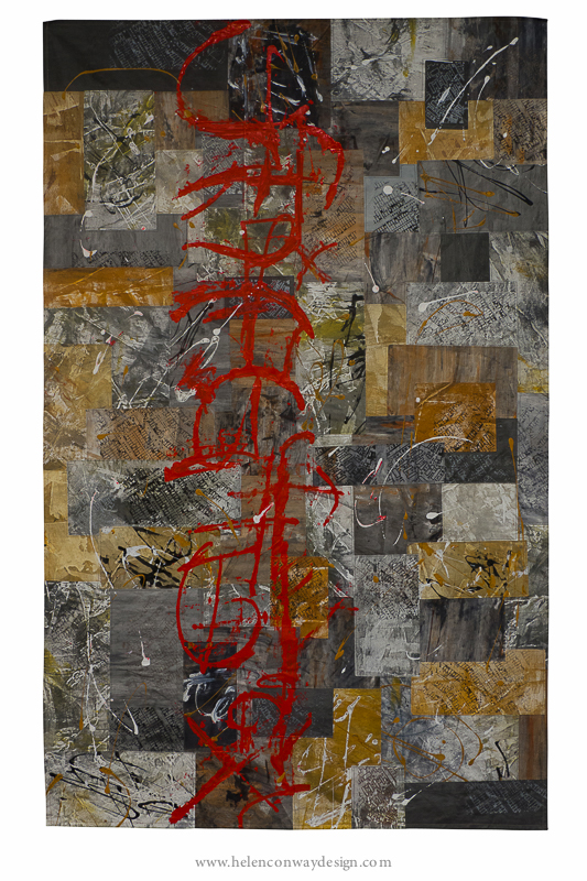
And we have well over a year to prepare. We will have about 15m each of wall at World of Glass and a massive 30m each at Stockport Wall Memorial Art Gallery. And we only have just over a year to prepare!! Thank goodness Stockport will be in the autumn.

My hope is to create two completely separate bodies of work albeit both stemming from three parallel series inspired by the urban and industrial landscape in and around both venues. But I have to also be realistic. I had an amazingly productive year in 2016 but my output still fell short of what I need to achieve in the next year or so. I blame my very loud and bossy 'voice'. It wants to work big. It insists on piecing lots of small pieces of fabric. And then it absolutely throws a tantrum if I don't complete the work with hundreds and hundreds of parallel lines of stitch. And, much to Helen's amusement, it even demands that I sew in all my ends.

Something has to change. I have to find a way to make smaller (and more affordable) works that I, but more importantly, my 'voice' can be happy with. So I have set aside the month of April to try new things. Can I make art that can be framed? Can I print onto paper? What happens if I print onto rough linen? Can I fuse my brick walls? Time will tell.

Traces at The World of Glass

It is with very great pleasure that I announce my second exhibition with Helen Conway. It will take place in early summer 2018 in the fanatastic Gallery One at The World of Glass in St Helens. Helen has written a great blog with photos of the gallery and insight into her inspirations and intent for the exhibition. Helen was brought up in St Helens; her family has lived there for several generation. It has provided the backdrop to her development as an artist. In her work she will trace her families lives and tell their stories. She will also explore her own history and the development of her creative process.

My art will continue to explore the urban and industrial landscape. St Helens has a strong industrial heritage. From the glass works which still exist today to the coal mines that now only exist in the towns collective memory. I want to build a collection of works that, whilst abstract, contain traces of man-made structures that the people of St Helens will recognise. Drawing them into the work, triggering memories.

Helen and I have set an ambitious schedule. Gallery One is a big space. As is the gallery at Stockport War Memorial Art Gallery where we will exhibit in autumn 2018. We are committed to creating work specifically for each venue. We are also determined to create exhibitions that are cohesive; where there are links between each others art. It is both terrifying and exciting. I hope you'll enjoy the journey!

Happy with the colours, now time to get printing

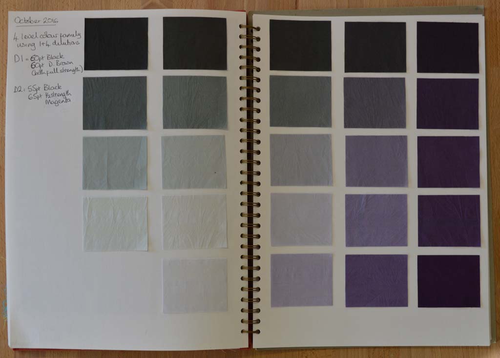
New 24 piece colour family After multiple attempts I am now happy with my new colour family. I am calling it 'traces' as I'm hoping to use it to create a new body of work based on iconic industrial buildings that no longer exist. I spent my childhood summers staying with my grandparents in a small village north of Nottingham. The area was criss-crossed with coal seams and every journey took us past pit heads. These buildings don't exist anymore but I bet most people my age who spent time in the north of England know exactly what I am thinking off.
I used magenta dye as one of the starting colours as an ironic reference to the way we tend to look at the past through 'rose tinted glasses'. Although many people mourned the loss of community when the coal industry declined I don't think anybody could remember working conditions in the pits or the polution in the surrounding areas through rose tinted glasses hence I have blended the magenta with black to the point where the colour just tips over from pink to purple. I particularly like the paler colours in the family.

Now that the colour family is fixed I've started work on creating the palette of fabrics. This could take several months as my ideas tend to evolve gradually as I work at the bench. However the way I used breakdown printing in my Still / Storm series gave results that were similar to what I have in mind for this new series. So this is where I'm starting.

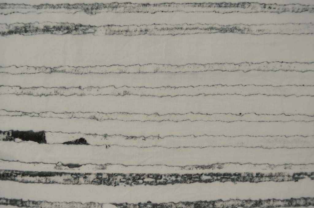
Fragile lines created by breakdown printing